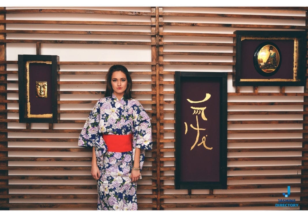
Asymmetrical balance is a composition that reads as balanced even though its two sides are not mirror images. Much of design education leans on the rule that elements should be symmetrical because people tend to find symmetry attractive. That rule holds up often enough to be worth teaching, but it is not the whole story. This is part 2 of 2. See the Asymmetrical Balance in Photography, Part 1.
The gallery below collects examples that put the idea into practice. Before you scroll through them, it helps to understand what actually makes an asymmetrical frame hold together, and why photographers reach for it in the first place.
Why asymmetry works
A symmetrical photograph places equal weight on both sides of a central axis. It feels stable and formal, which is why it suits architecture, portraits shot head on, and product images that need to read as neat and dependable. The trade-off is that perfect symmetry can feel static. Once the eye confirms that the left matches the right, there is little left to explore.
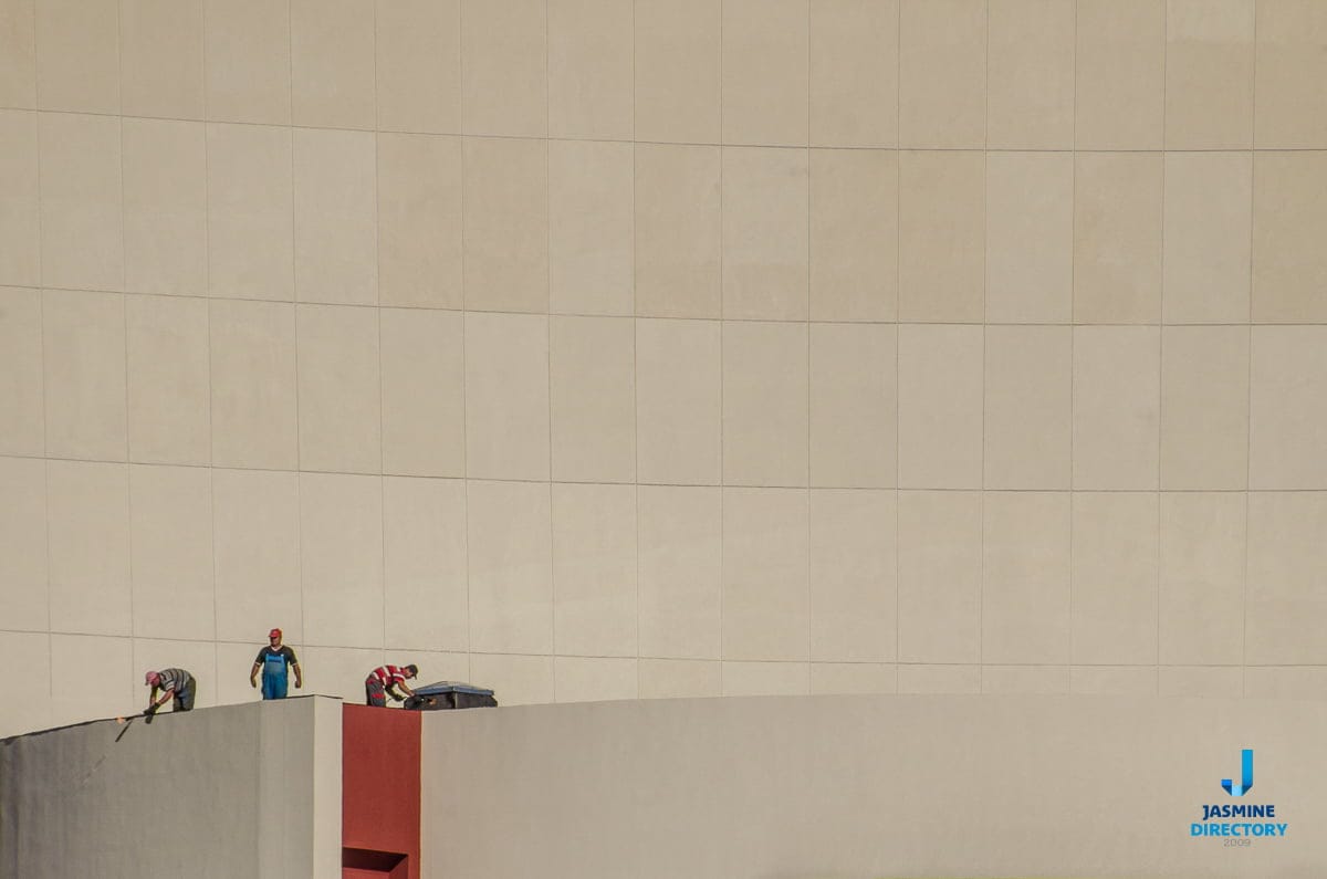
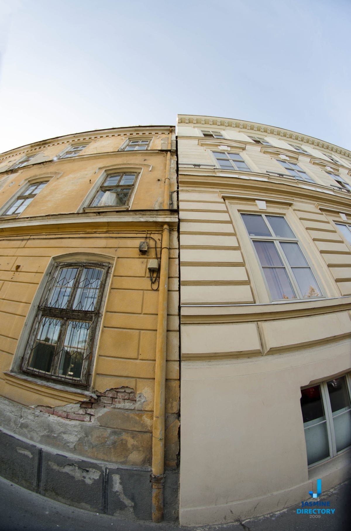
Asymmetrical balance keeps the sense of equilibrium while giving the eye somewhere to travel. You balance a large element on one side against several smaller ones on the other, or a dark mass against a bright point, or an empty stretch of frame against a dense, detailed corner. Nothing matches, yet the picture does not tip. Visual weight, rather than mirror geometry, does the work.
Several factors decide how much weight an element carries:
- Size. Larger shapes pull harder, but a small object can hold its own if it is bright, sharp, or isolated.
- Contrast and tone. A dark form against a light field feels heavy. A single warm accent in a cool scene draws attention out of proportion to its size.
- Position. Elements near the edge of the frame exert more leverage than those near the center, the same way weight at the end of a seesaw counts for more.
- Complexity. A busy, textured region reads as heavier than a plain one, so a small patch of detail can balance a large empty area.
- The human eye. Faces, hands, and eyes attract attention almost automatically and can anchor a composition even when they occupy little space.
Composing an asymmetrical frame
The rule of thirds is the usual starting point. Place your main subject on one of the thirds rather than dead center, then use the opposite side of the frame as counterweight: a smaller figure, a line that leads back toward the subject, or simply open space that gives the picture room to breathe. Negative space is not wasted space. It is one of the most reliable ways to balance a strong subject without cluttering the shot.
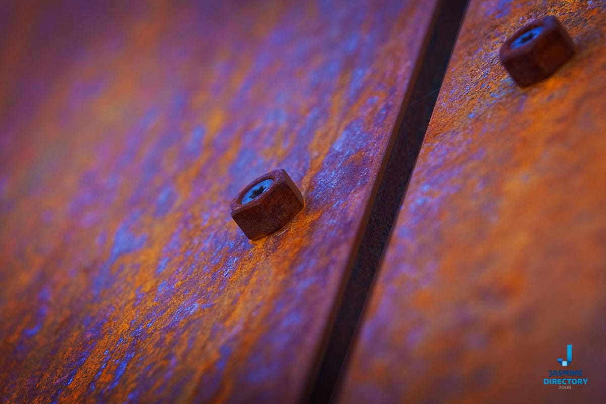
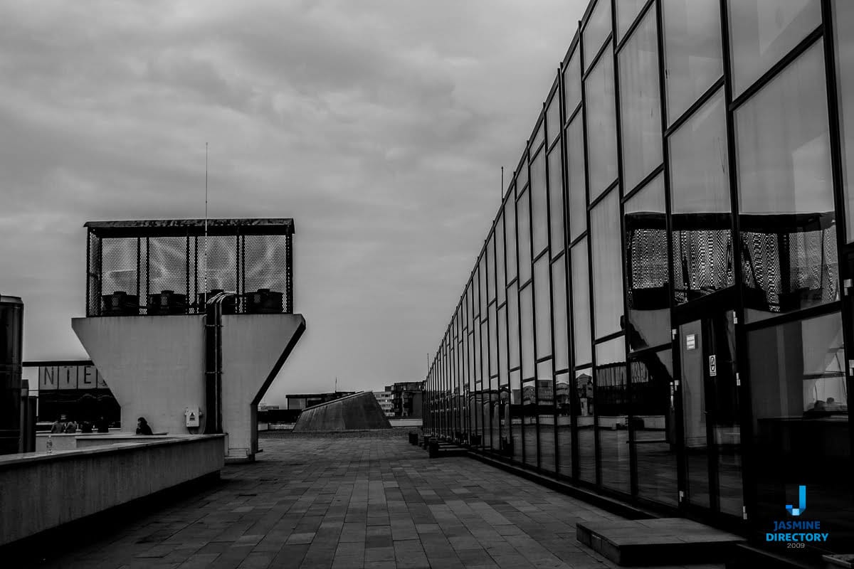
Leading lines and diagonals help too. A path, a shoreline, or the edge of a building can carry the eye from a light corner into a heavier one, tying the two sides together. Colour can play the same role. A single saturated element balances a wide field of muted tone, and warm and cool areas can be set against each other so neither dominates.
When you review your own frames, try squinting at them. Squinting collapses detail into blocks of light and dark, which makes it easier to see whether the weight is spread the way you intended. If one side feels like it is dragging the picture down, recompose, wait for a subject to move into the gap, or change your position rather than crop your way out of the problem later.
Reading a photograph the way viewers do
Balance matters partly because of how people take in an image. Viewers do not study a photograph pixel by pixel. They scan it, settle on a point of interest, and move on quickly, especially online where a picture competes with everything else on the page. Jakob Nielsen’s early web research found that 79% of users scanned any new page they came across, while only 16% read word by word. The lesson carries over to images: your composition has a second or two to guide the eye before the viewer decides whether to stay. Asymmetrical balance gives you a way to steer that first glance toward the subject and then let it wander, instead of pinning it to the middle of the frame.
That is worth keeping in mind if your photographs are meant to earn attention, not just sit in an archive. A product shot, a portfolio image, or a listing photo has to work in a crowded feed. A well balanced asymmetrical frame tends to hold the eye longer than a flat, centered one, which is a practical advantage when you are trying to be noticed.
Where the images go after you shoot them
Composition is the first step. Getting the work in front of people is the second, and it follows the same logic of guiding attention. Most people looking for a photographer, a studio, or any local service start online. Pew Research Center found that Americans rely on the internet ahead of any other source for local business information, with 36% turning to search engines for local businesses generally. If your images are strong but buried, the balance you worked into each frame never gets seen.
This is where being listed in curated, human reviewed places helps. Search results are not a neutral map of everything that exists, and a directory that a person has checked and organized gives a smaller operator a fair chance of being found. Reviews and ratings reinforce that once someone arrives. As Robert Cialdini describes with the principle of social proof, people work out what is correct by looking at what others think is correct, which is exactly why a portfolio with visible feedback tends to convert browsers into clients. Good photographs and a trustworthy presence pull in the same direction.
The examples
With the principles in mind, look through the gallery below. In each case, ask where the visual weight sits, what balances it, and how the empty parts of the frame earn their place. The point is not to copy any single arrangement but to train your eye to notice balance where there is no symmetry.
Photo credit: jasminedirectory.com Photo credit: jasminedirectory.com Photo credit: jasminedirectory.com Photo credit: jasminedirectory.com Photo credit: jasminedirectory.com Photo credit: jasminedirectory.com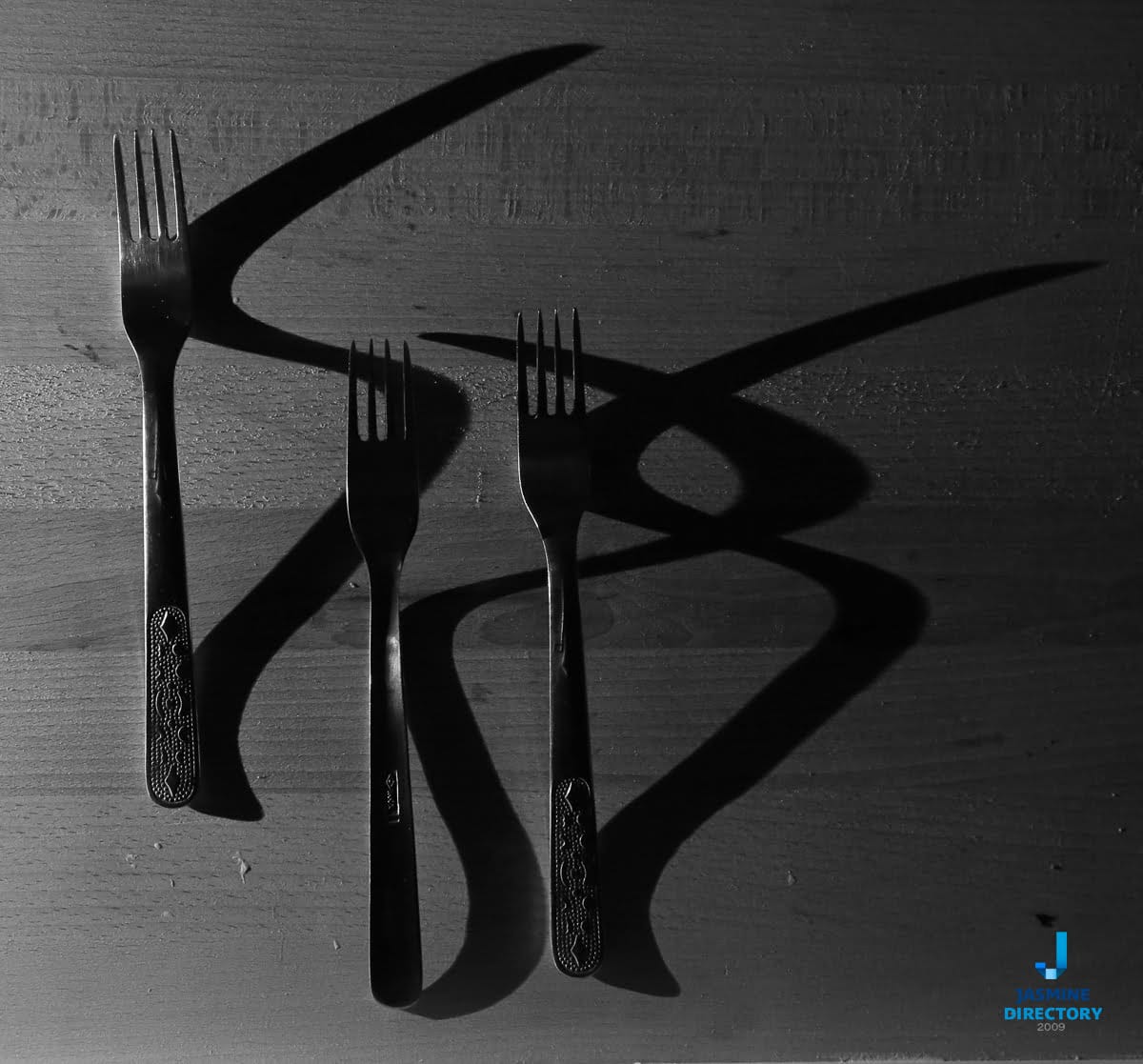
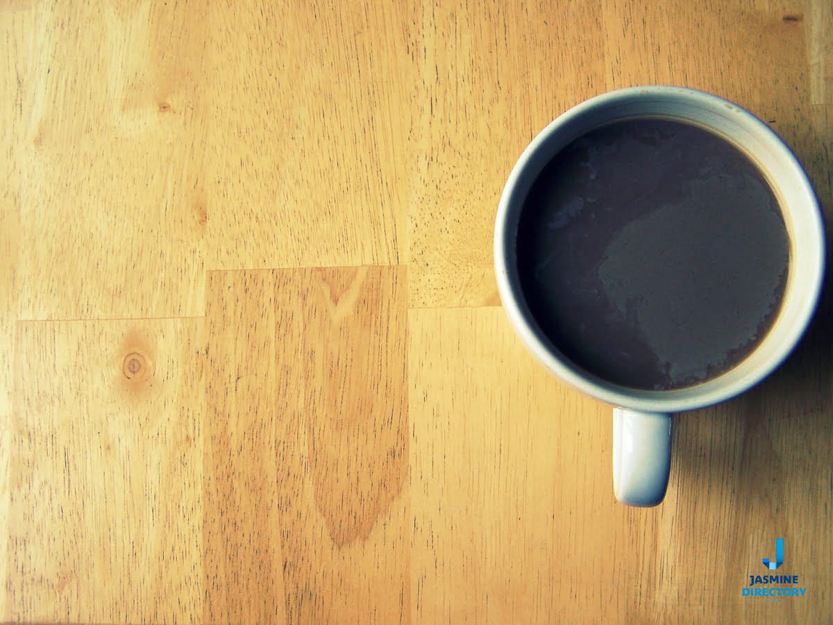

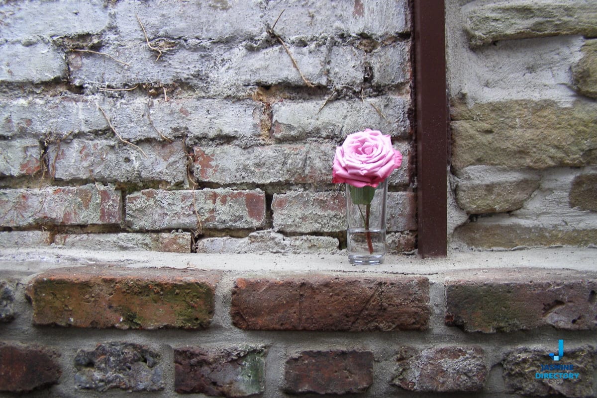
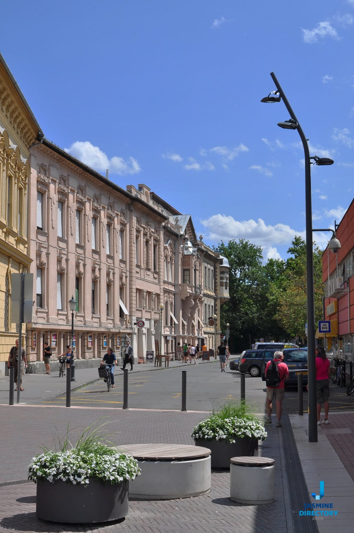
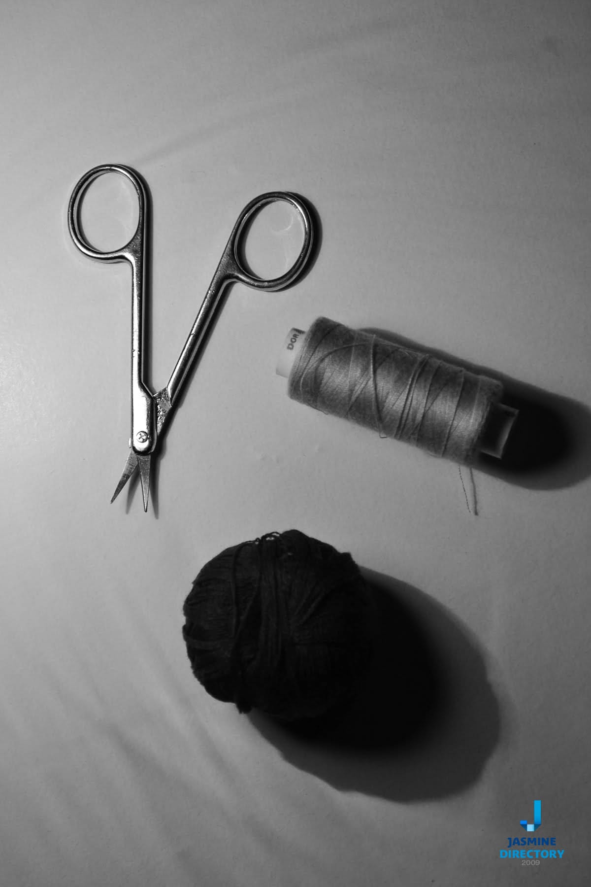

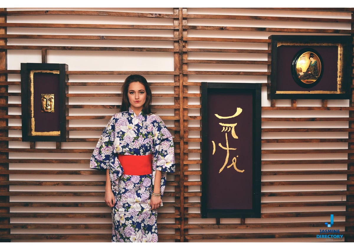
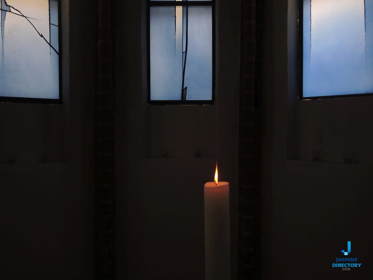


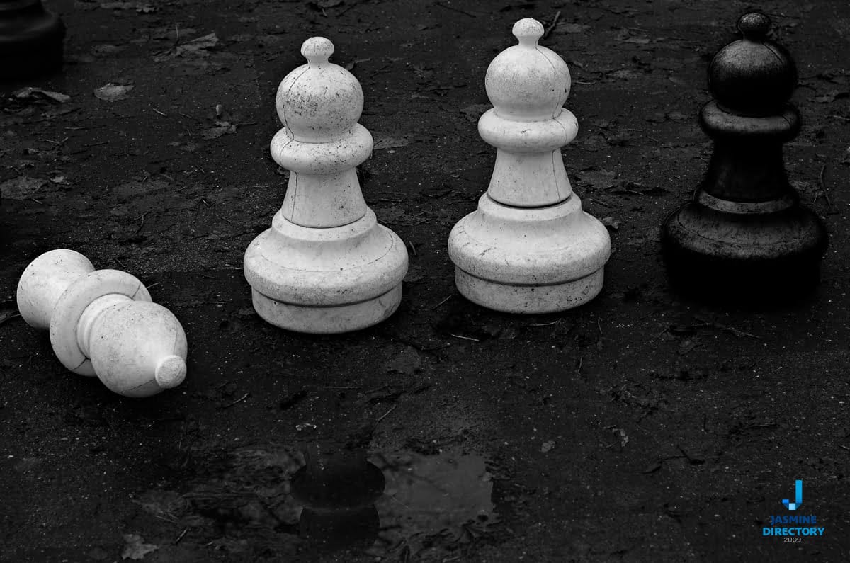
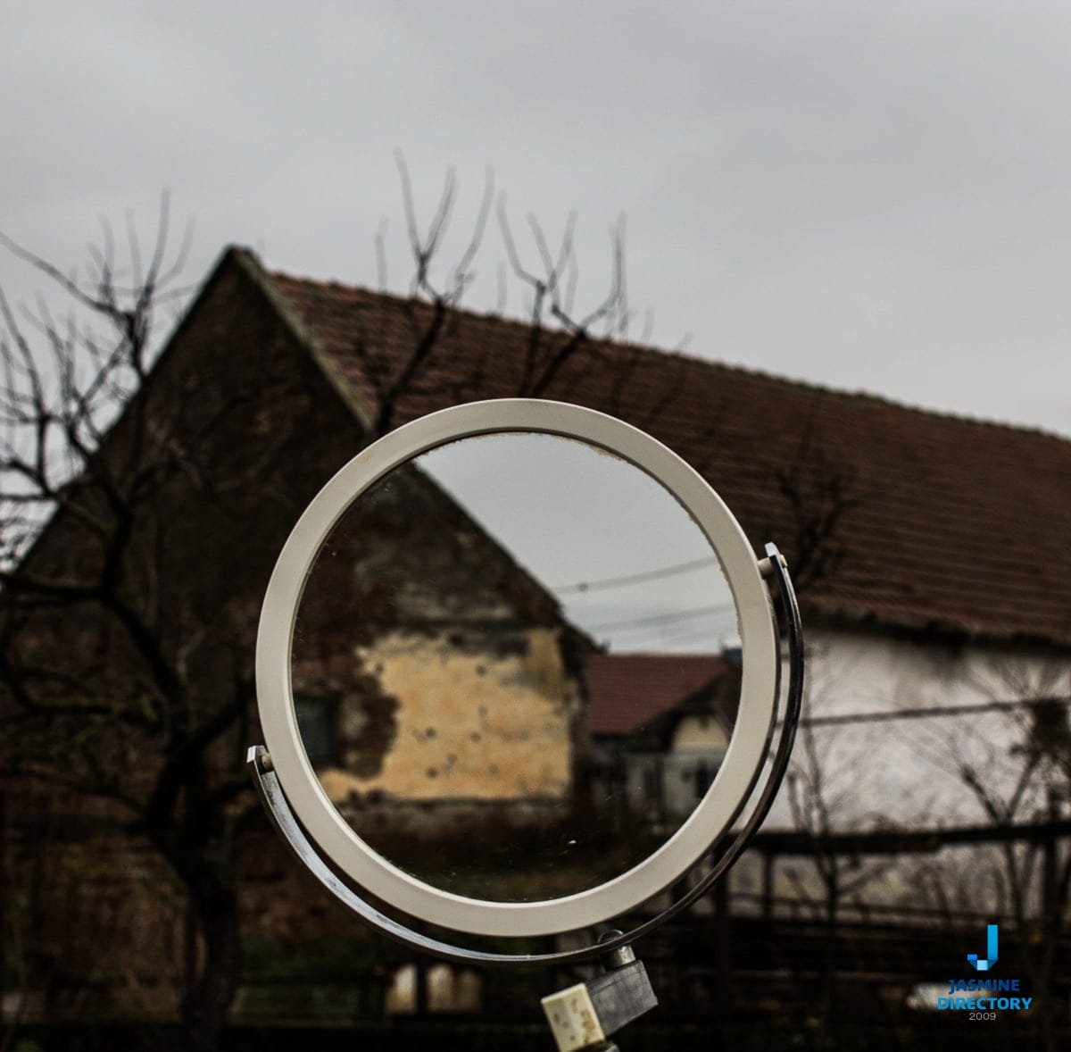
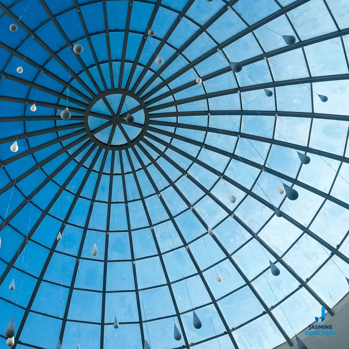

One practical takeaway to carry into your next shoot: before you press the shutter, glance at the two halves of the frame and ask which one is heavier and what is holding the other side up. If you cannot answer, move the camera until you can. That single habit will do more for your compositions than any rule about symmetry.