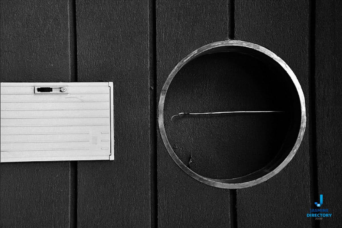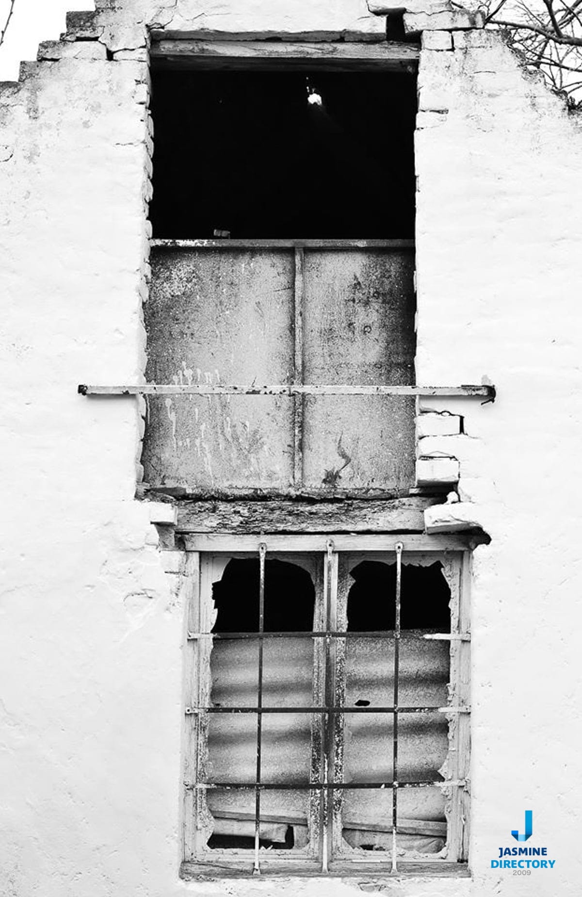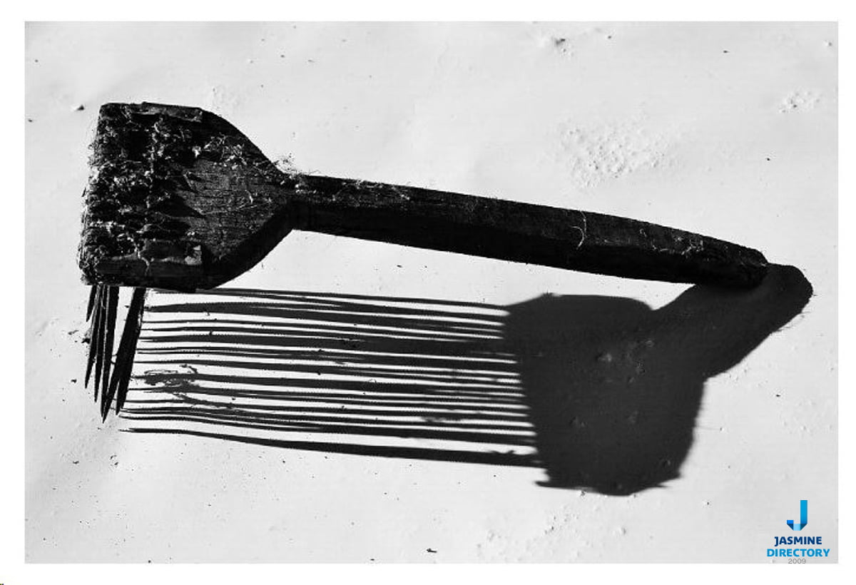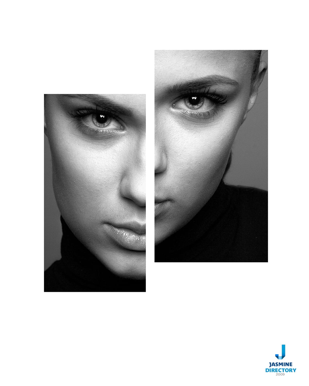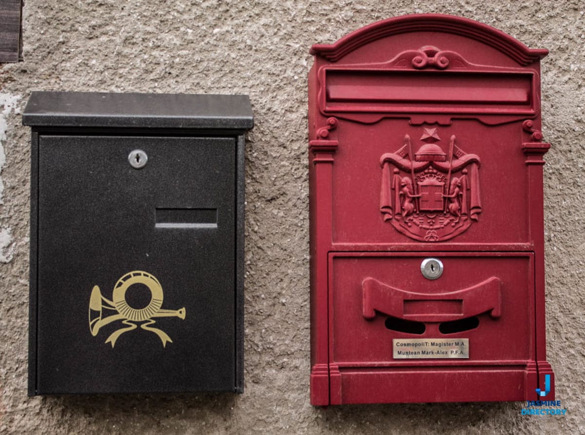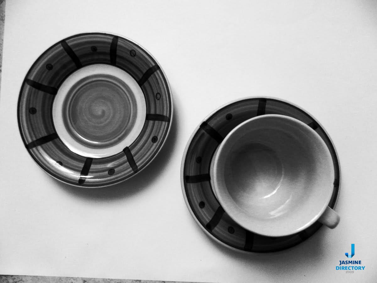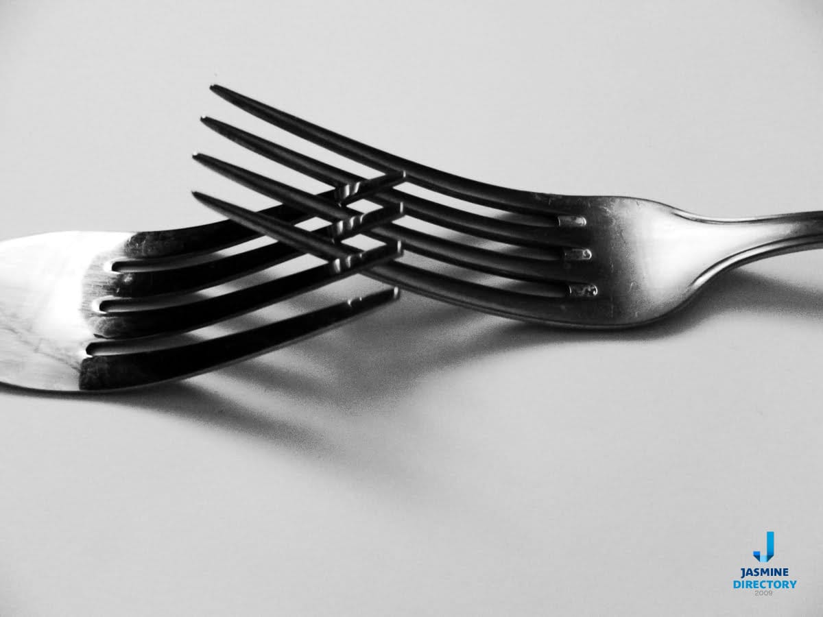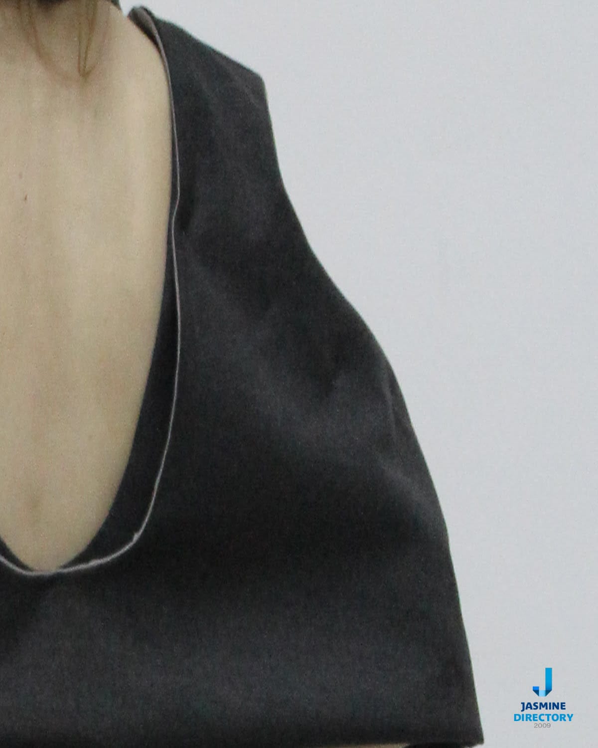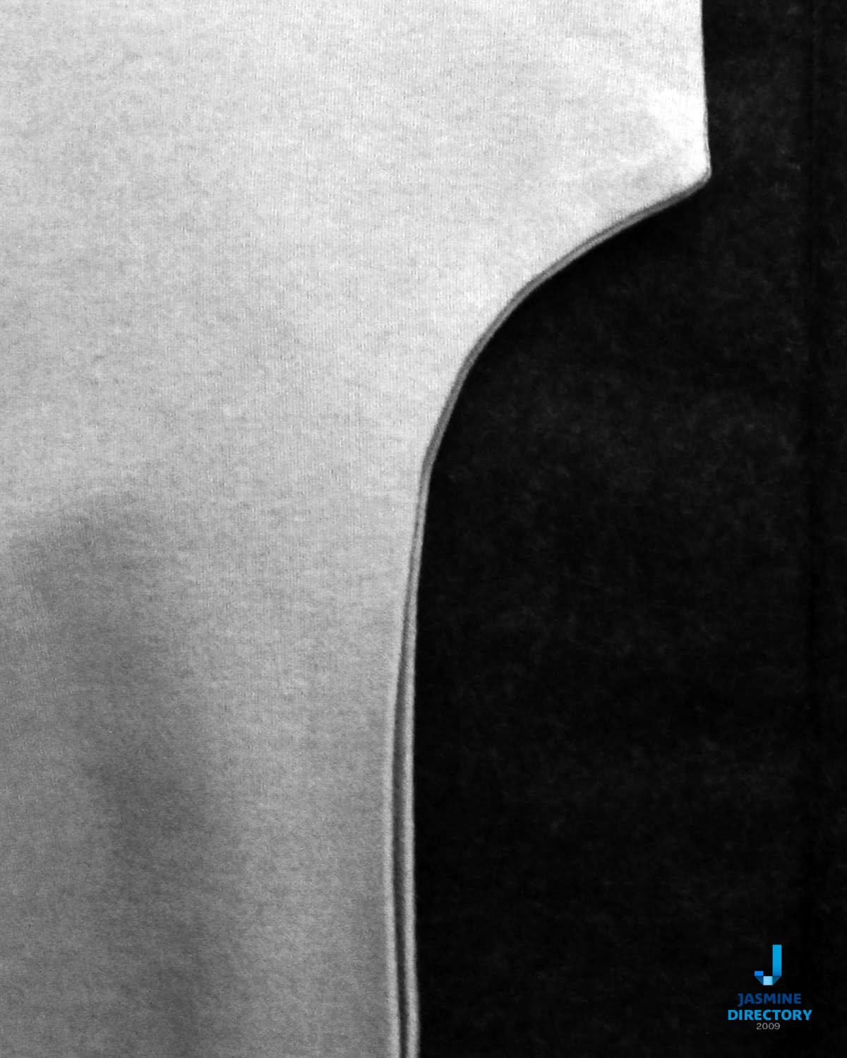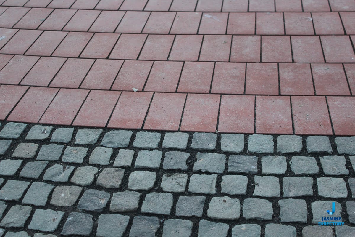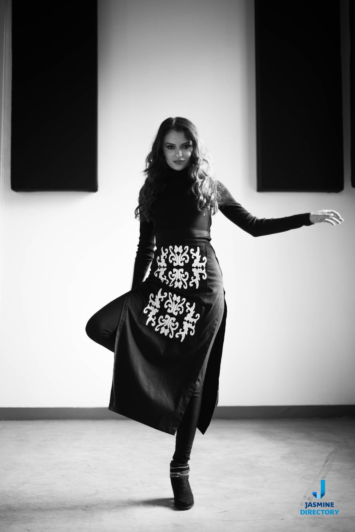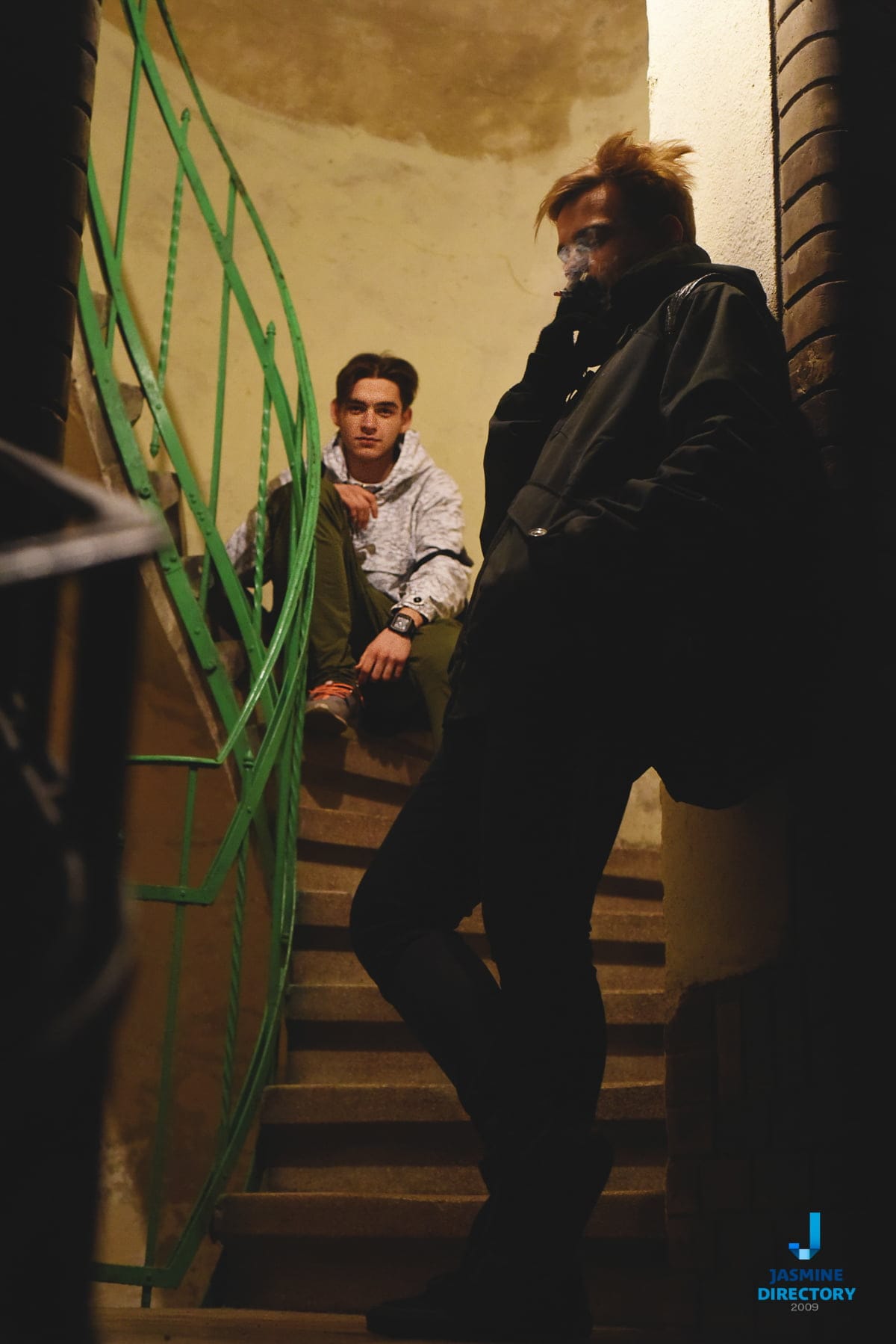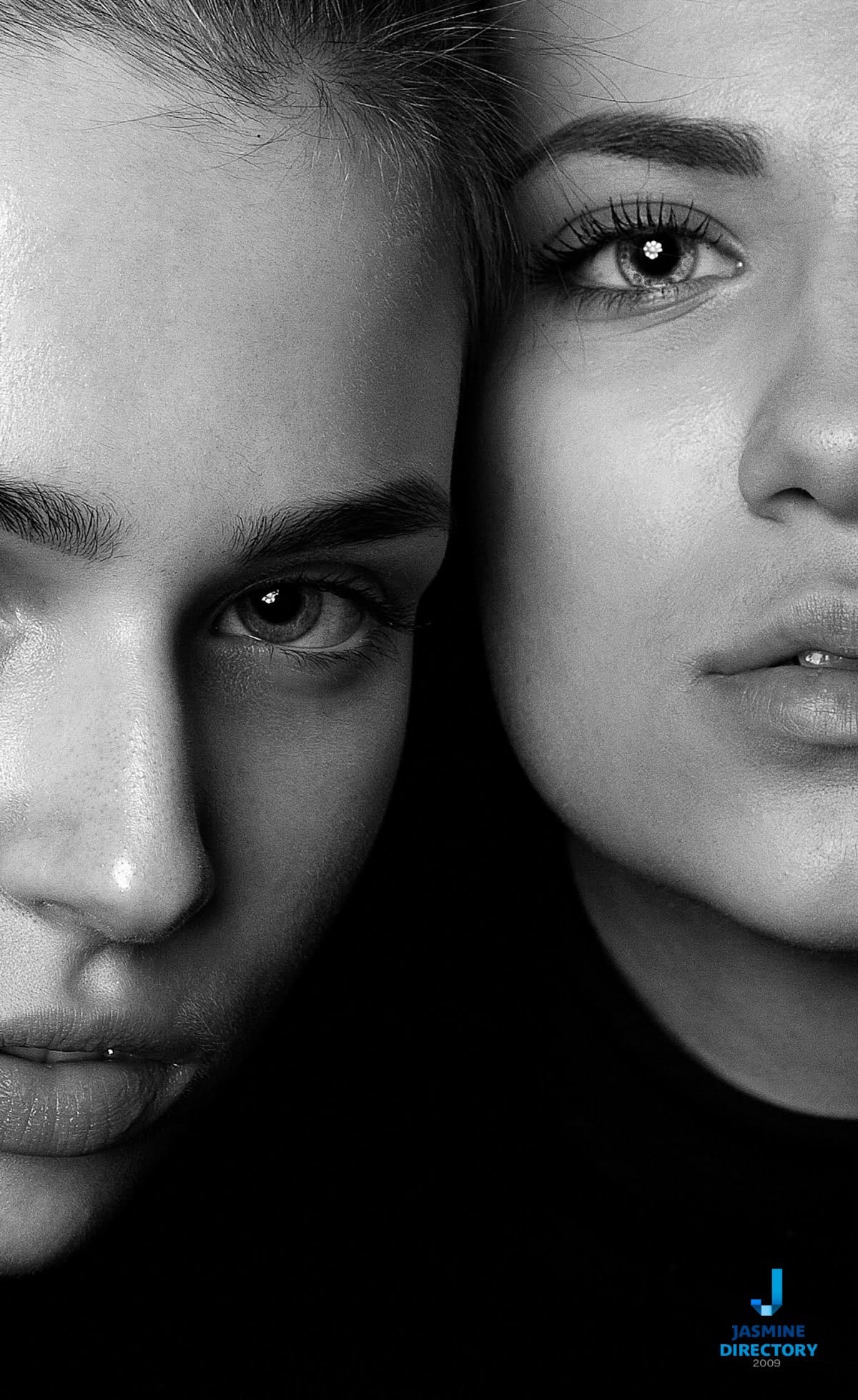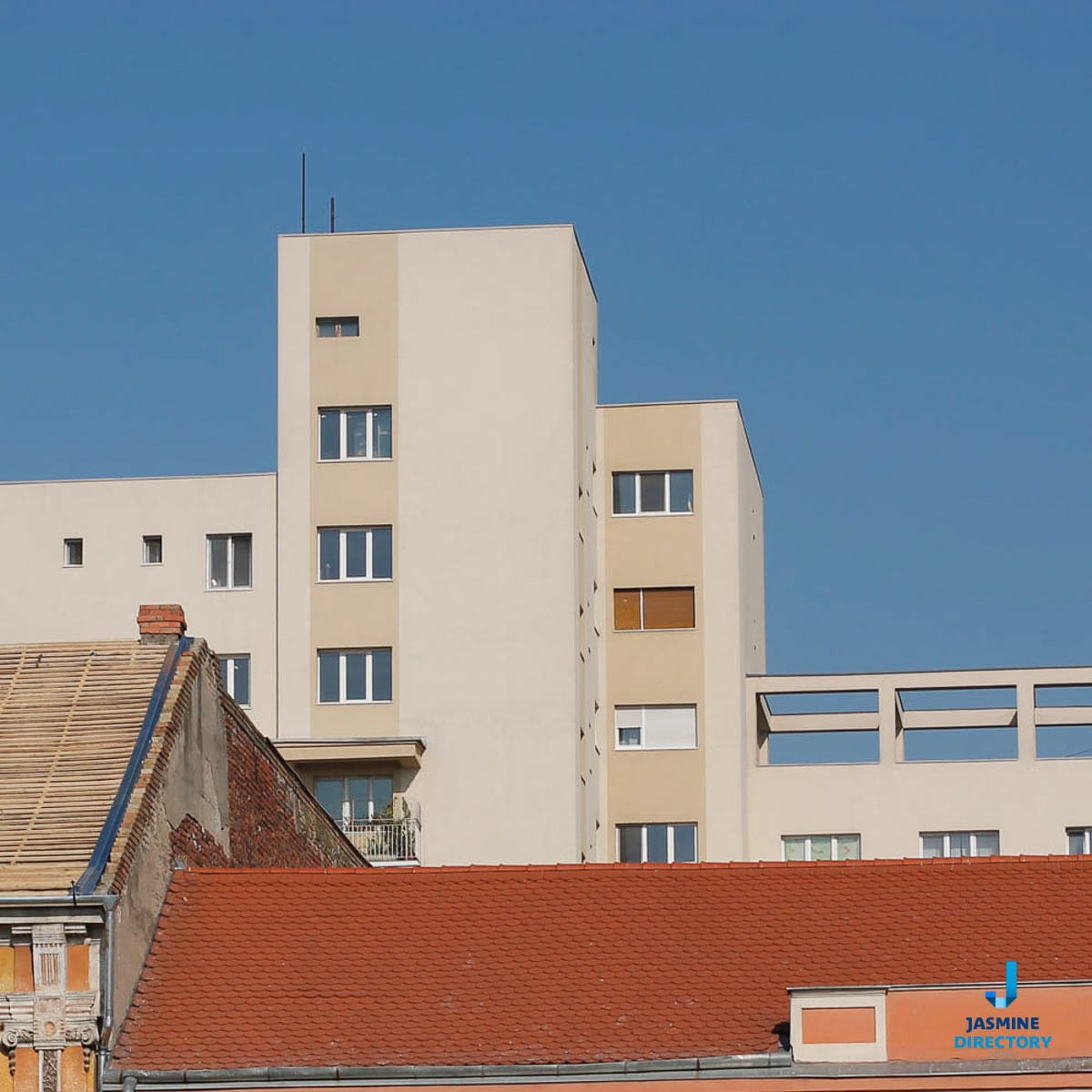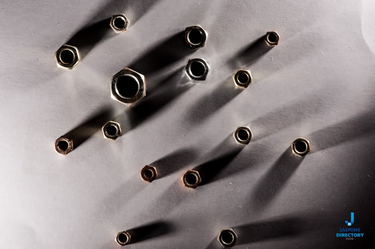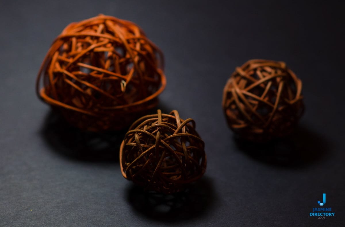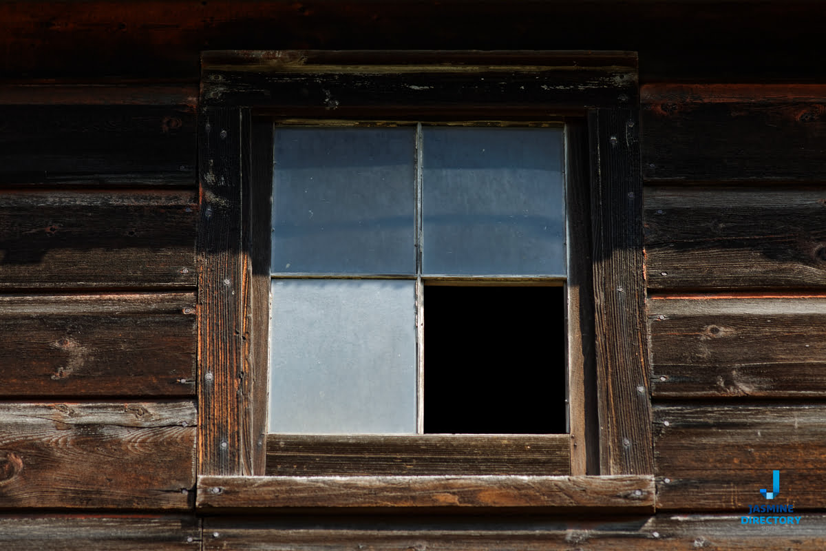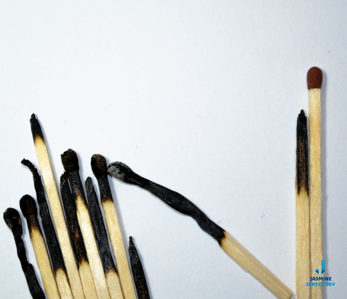
One of our plans for 2020 is to write about and showcase examples of the rules that shape good photography. This first piece looks at asymmetrical balance, a design approach that reads as balanced even though the two halves of the frame are not mirror images of each other. Most design education starts from the opposite idea. It teaches that elements should be arranged symmetrically because people tend to find symmetry pleasing and easy to process. See part 2 of asymmetrical balance in photography.
What asymmetrical balance actually means
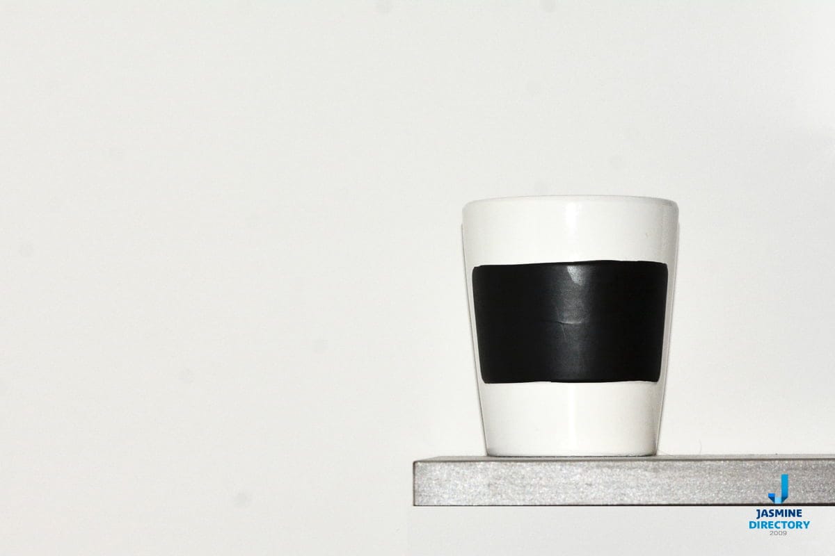
Symmetry gives you a reliable, calm result. Split the frame down the middle and place equal weight on each side, and the eye settles. The trouble is that perfect symmetry can also feel static and predictable. Asymmetrical balance keeps the sense of equilibrium while breaking the mirror. You place a small, bright, or high-contrast element on one side and counter it with a larger, quieter area on the other. Neither half copies the other, yet the picture does not tip over.
The idea rests on visual weight rather than physical size. A single face in shadow can hold as much attention as a wide sweep of empty sky. A patch of saturated red can balance a much larger field of grey. When you compose this way, you are weighing those competing pulls against each other and arranging them so the total settles into something stable but alive.
What gives an element weight
Several qualities decide how heavily a part of the frame reads. Understanding them lets you predict, before you press the shutter, whether a composition will hold.
- Size. Larger shapes usually carry more weight, though not always enough to dominate on their own.
- Contrast and tone. A bright object against a dark background pulls the eye hard, so it can balance a much bigger low-contrast area.
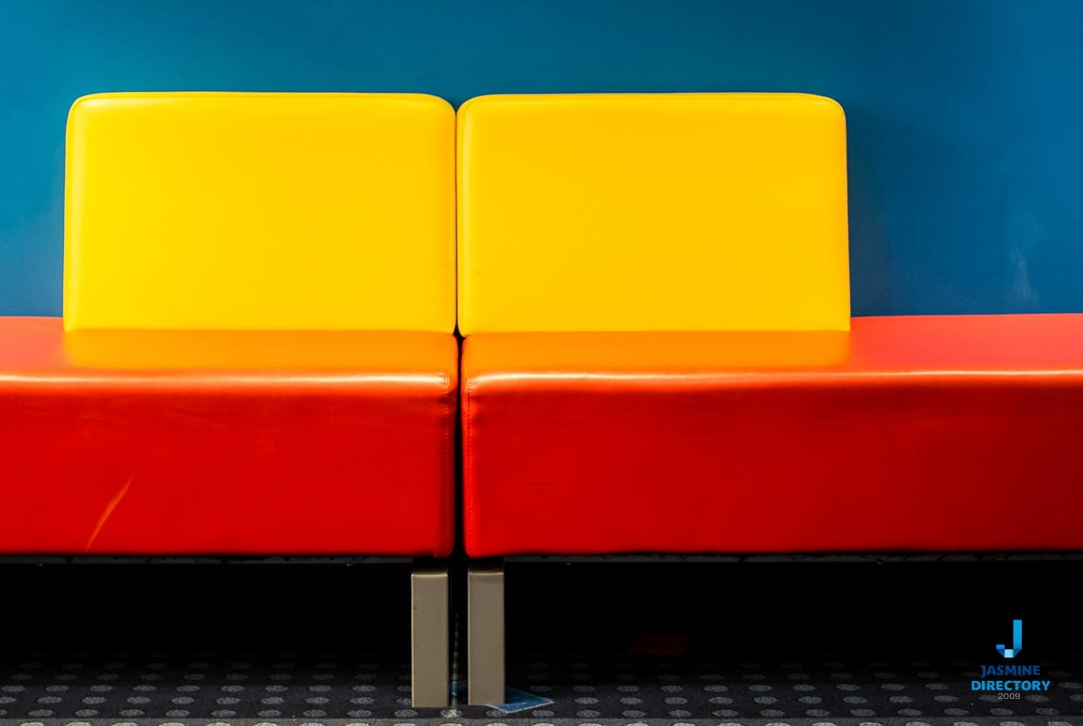
- Colour. Warm and saturated colours advance and feel heavier than cool, muted ones. A small red or orange note can offset a large expanse of blue or green.
- Detail and texture. A busy, detailed region holds attention longer than a smooth, empty one, so it weighs more.
- Position. Objects near the edge of the frame exert more leverage, the way weight further from the centre of a seesaw has more effect.
- The human factor. Faces, eyes, and the direction a person is looking all draw the gaze immediately, regardless of their size in the frame.
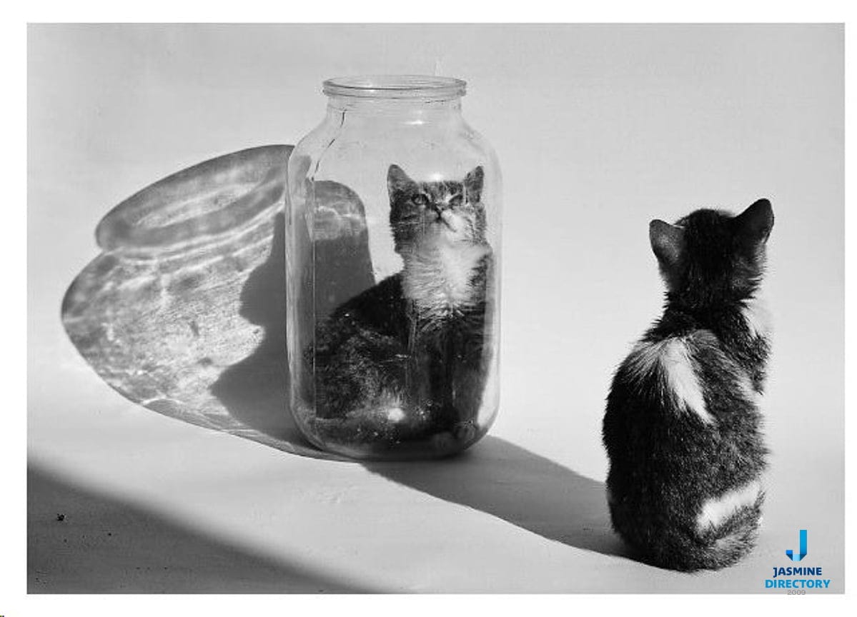
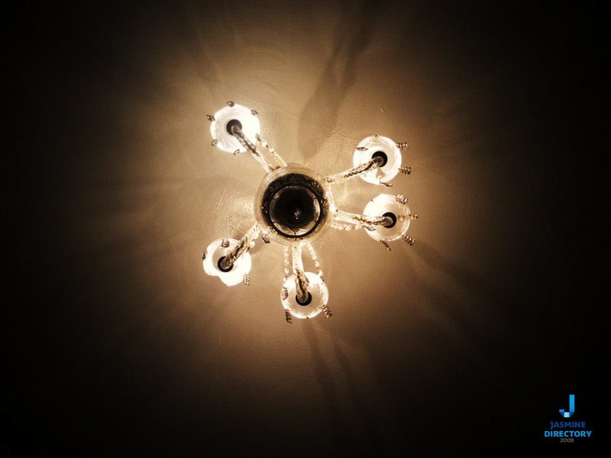
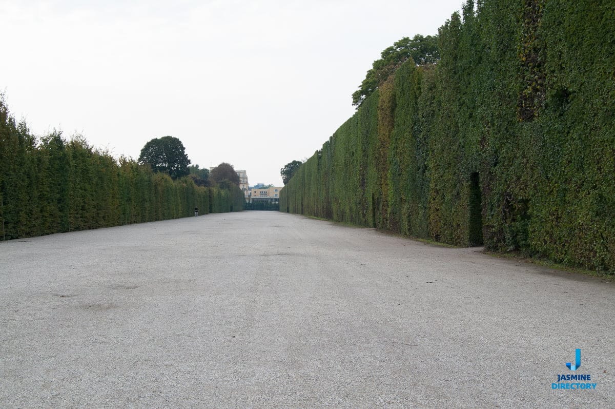
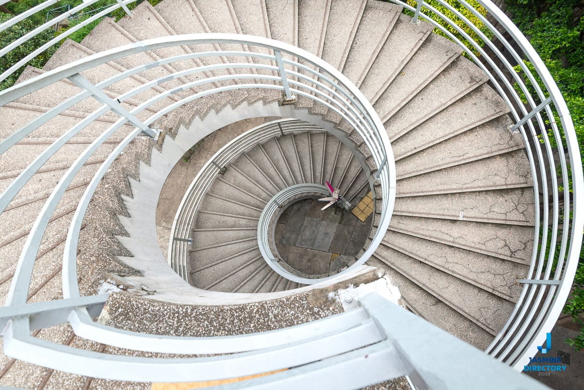
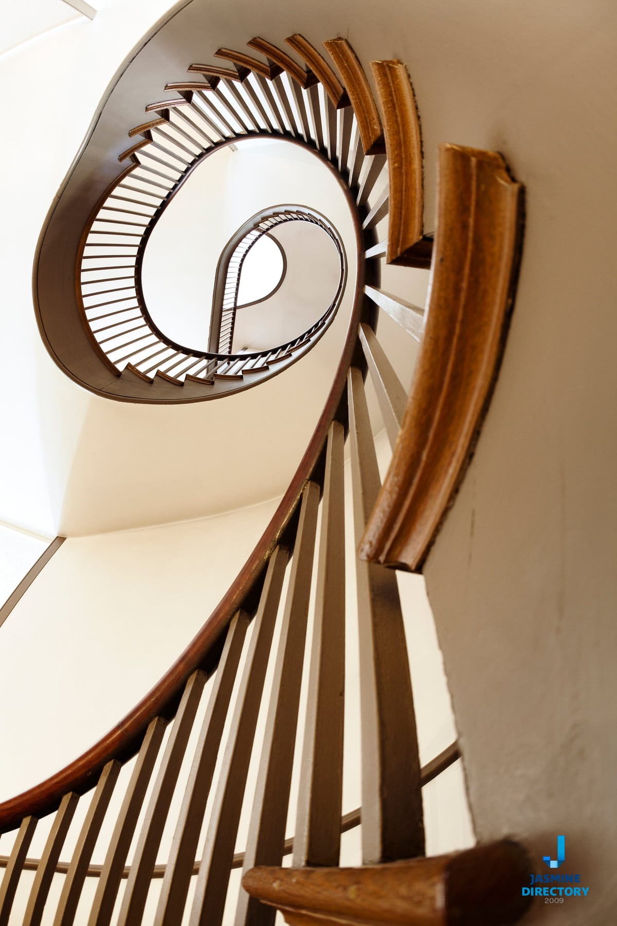
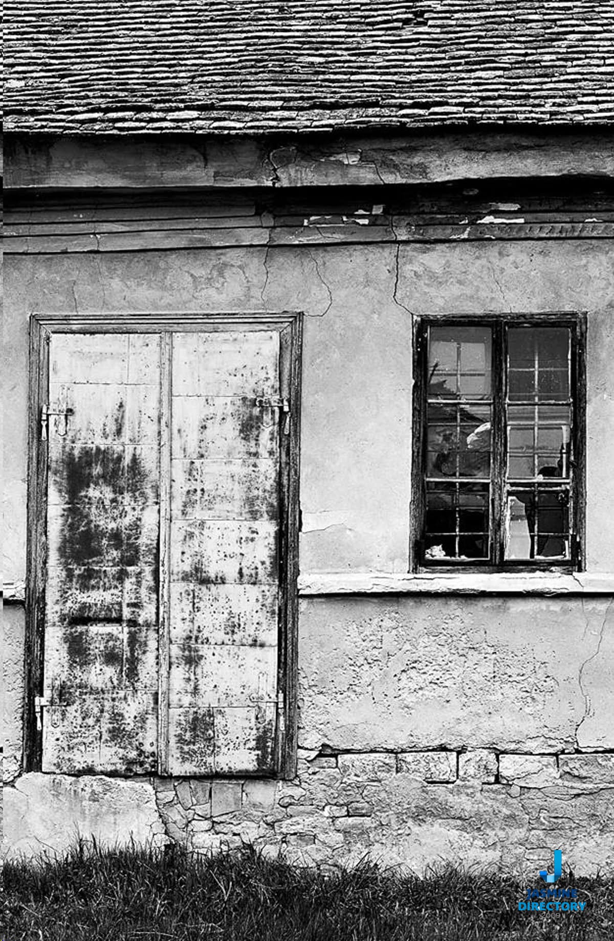
Once you can read these cues, you start to see them everywhere. A lone figure in the lower left corner balanced by a large bank of cloud in the upper right. A single lit window in a dark facade holding its own against the whole building. The examples below show the principle at work across different subjects and lighting.
How to compose for it in the field
Working with asymmetry is partly a matter of moving your feet and partly a matter of patience. Begin by identifying your main subject, the thing you want the viewer to notice first. Then look for a secondary element that can counter it from the opposite side of the frame. That counterweight might be a shadow, a reflection, a smaller object, or simply a large area of negative space. Negative space is not wasted space here. It does real work, giving the heavier element room to breathe and holding the balance in place.
A practical habit is to imagine a vertical line down the centre of the viewfinder and ask which side feels heavier. If the answer is obvious and uncomfortable, adjust. Step sideways, change your height, or wait for a person or vehicle to enter the lighter half. Small movements shift the relationships quickly. The grid overlay on most cameras and phones helps, since it gives you fixed reference points for where the weight is landing.
Cropping in editing is your second chance to get the balance right. If a frame feels lopsided, trimming one edge can restore the tension between the two sides. Just be careful not to crop so tightly that the counterweight loses the space it needs to function.
Common mistakes worth avoiding
- Piling too much weight on one side with nothing to answer it, so the image simply looks off rather than deliberately asymmetrical.
- Placing the main subject dead centre out of caution, which throws away the energy asymmetry offers.
- Forgetting that colour and contrast can outweigh size, and then wondering why a large object still fails to hold the frame.
- Filling every corner, which leaves the eye no quiet area to rest and no negative space to do its balancing work.
Why any of this matters beyond the frame
Composition is not only an artistic concern. If you shoot for a business, a portfolio, or a listing, the way you balance a frame affects whether people stop and look at all. Attention online is scarce and fast. Jakob Nielsen’s early study of web reading found that 79% of users scanned any new page they came across while only 16% read it word by word, which is why strong visual cues matter so much for anyone competing for a glance. A well balanced photograph works the same way as a clear headline: it gives the eye an obvious place to start and a reason to stay.
That has direct value for people who are trying to be found. When someone is comparing photographers, venues, or services, the images often carry the first impression before a single word is read. Good composition signals care, and care is one of the things people quietly use to judge whether a business is worth their trust. Being present in curated, human reviewed places, with images that hold up, is part of how a small operation earns a second look rather than getting scrolled past.
Photographs are only the first of many checks a serious buyer runs, and buyer confidence in high-value purchases is built from small signals like this one.
Study the examples below with the weight questions in mind. Cover one half of each photo with your hand and notice what changes. You will start to feel where the balance sits, and that instinct is what carries over to your own shooting.