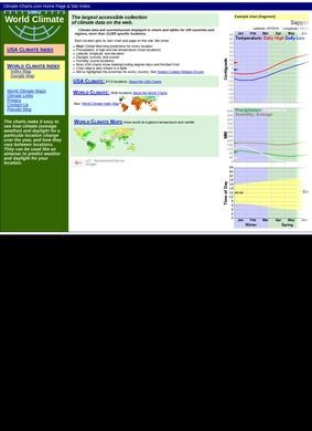
Climate Charts is a free reference site that gathers long-run weather data for locations around the world and plots each one as a simple graph and a matching table. It describes itself as "the largest accessible collection of climate charts on the web," and the figures behind that claim are concrete: 15,676 charts for the United States, another 3,188 covering more than a hundred countries and regions, and over 12,000 individual places in all. That is a lot of ground for a site that asks nothing of the visitor and hides nothing behind a login or a paywall.
Each Climate Charts entry answers a plain question. What is the weather usually like here, and when? For a given location the page lays out temperature highs and lows, precipitation, the length of daylight, sunrise and sunset times, and the latitude and longitude, presented both as a chart you can read at a glance and as a table for anyone who wants the exact figures. One view for the impression, the other for the arithmetic. A traveler skims the graph; a researcher copies the table.
Climate Charts wraps those pages in a handful of supporting sections. "Climate Links" points out to other climate resources on the web. "Reading the Charts" walks a first-time visitor through worked examples so the lines and columns make sense, which is a thoughtful touch on a site that could easily assume everyone already knows how to read a climograph.
There is a set of "World Climate Maps," an "Index Map" that lets you click your way down to a region, and an "About the Charts" page explaining where the underlying numbers come from. The structure is plain, and it suits material that is meant to be looked up, not browsed for pleasure.
The audience is easy to picture: a traveler deciding whether to pack a raincoat for a place never visited, a researcher pulling seasonal averages for a report, a student or a retiree weighing where to spend the winter. Climate Charts serves the practical question of what a location's weather tends to do across a full year, daylight included, which most quick forecast sites skip over entirely because they are built to tell you about tomorrow, not about a typical July.
That distinction is the whole reason a site like this exists. A forecast tells you Tuesday; a climate chart tells you the shape of a place across every month, which is what you actually need when the trip is still a season away and all you have settled on is the destination.
Reading the charts and what they hold
The worth of Climate Charts rises and falls on how usable those thousands of pages are. Sheer volume means little if the data is a chore to read, so the decision to give every location both a graph and a table is the sensible part of the design. A glance answers the rough question; the table settles the precise one.
There is nothing clever about the presentation, and that plainness is arguably its strength, because a reference you consult in a hurry should not make you fight the interface. The index map and the regional navigation exist for the same reason, to get a visitor from a whole continent down to a single town in a few clicks.
Numbers, graphs, and daylight
The daylight detail is the piece that sets Climate Charts apart from an ordinary weather lookup. Sunrise and sunset times, and the duration of daylight mapped across the seasons, tell you something a temperature average cannot: how long the day itself will be when you arrive.
Anyone planning a trip to a far-northern town, where the summer and winter days swing to extremes, gets real information from that alone. Fold in the temperature highs and lows and the precipitation figures, and a single Climate Charts page paints a fuller portrait of a location's year than a plain search usually turns up.
The tabular format is the quiet workhorse here, because it lets a careful reader compare month against month without squinting at a curve, and it turns a pretty picture into something you can plan around.
Sources, contact, and the gaps
Credit where it is due. The site does not hide its methods, and the "About the Charts" page spells out the data sources, something worth having in a reference tool people might quote in their own work. A chart is only as good as the record behind it, and naming that record is the difference between a resource and a guess.
Contact is thinner. There is a contact page and a separate privacy policy, but the landing page carries no phone number, email, or address, so anyone wanting to reach the people behind Climate Charts has to click through to find out how. For a free informational site that is a small thing, and a form or an address one layer down is normal enough.
Still, a single line of contact on the front page would cost nothing and would settle a first-time visitor's trust a little faster.
As for outside opinion, there is almost nothing to report. A search turns up the site's own pages and a scatter of similarly named but unrelated projects: a NOAA climate portal, a separate tool called ClimateCharts.net, assorted government weather pages, a company trading under "Scientific Climate Ratings." None of them review Climate Charts itself.
There are no star ratings and no aggregated user score from any third party. Climate Charts carries no outside verdict to lean on, and that absence is worth stating plainly, because it means the site has to be judged on the data it presents and the honesty of its stated sources, with no crowd to vouch for it either way. That is a fair enough position for a quiet reference tool, though it does put the burden on the visitor to decide whether to trust it.
For most people that trust will come down to a simple test: do the numbers match what they already know about a place they have actually been? If the chart for a familiar city looks right, the ones for an unfamiliar destination earn a little more confidence, and Climate Charts holds up well to that kind of spot check.
Fit is the real test here. Someone who needs seasonal temperature, rainfall, and daylight figures for a specific place, laid out cleanly and backed by sources the site names, gets exactly that from Climate Charts, at a scale few free sites match. The interface feels dated next to a slick weather app, and there is no live forecast, only the long-run pattern a place tends to follow year after year. That trade, a cited snapshot of a typical year instead of a live one, is a fair deal for research and planning, not for checking tomorrow's rain.