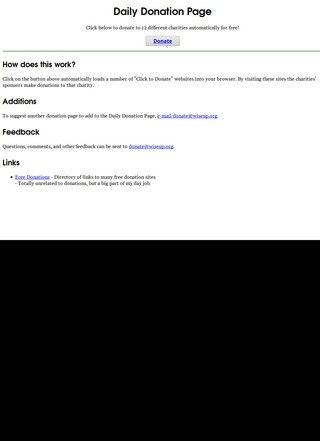
Giving to charity without spending a cent sounds like a contradiction. That is the question Wiseup.org answers, and the mechanism is simple enough to explain in one breath: the donate page pulls together a batch of "click to donate" charity sites and loads them in a single browser session, so that the sponsor advertisers funding each of those pages make a small contribution every time a page is viewed or its donate button is pressed. The visitor pays nothing. On Wiseup.org the money comes from the companies buying ad space on the partner sites, and the click is what releases it.
Twelve charities bundled into one visit
What makes the page useful is the bundling. Visiting a dozen separate click-to-donate sites by hand is tedious, and most people who mean to do it once never come back. Wiseup.org collapses that chore into one stop. The page runs twelve charities at once, spanning hunger relief, animal welfare, children's causes, literacy, and rainforest preservation, among others in a similar vein. Open the page, let it cycle, and each supported cause registers its sponsored donation. The breadth is the point: instead of choosing between feeding people and protecting habitat, a visitor triggers contributions across all of them in the same sitting.
No sign-up or payment needed
I went in expecting something flimsier than it turned out to be, and the honest surprise was how little it asks of you. There is no account to create, no card to enter, no newsletter to dodge. Anyone with an internet connection, anywhere, can use it, and the absence of a sign-up wall is the most credible thing about the model. A site that wanted your data or your money would have built a funnel. Wiseup.org just runs the pages and gets out of the way.
Suggestions from visitors keep the list fresh
Beyond the core loader, the page leans on its users to keep the list alive. There is a community suggestions feature where visitors can propose additional click-to-donate platforms to fold into the rotation. The practical reason is worth stating plainly: click-to-donate sites have a habit of quietly going dark when a sponsor pulls out or a charity shuts its program. A rotation that depends on a fixed, aging list would slowly fill with dead links. Letting the audience flag new and working platforms is a sensible way to fight that decay, even if it does put some of the upkeep on the goodwill of strangers.
Pointing users toward other giving tools
The page also points outward, with a directory link to other free donation resources. It is a small gesture, and a telling one. A click-to-donate aggregator competing for attention would hoard its visitors; pointing them toward rival free-giving tools suggests the people behind the project care more about the giving than about the traffic. Whether that holds up depends on how well-maintained those outbound links are, which the page itself does not promise.
Small clicks add up over time
One thing worth being clear-eyed about: the sums involved in any single click-to-donate action are tiny. This is not a substitute for writing a charity a real cheque, and Wiseup.org does not pretend otherwise. The value is in the aggregation and the zero friction. Someone who runs through it daily contributes a trickle that, multiplied across many visitors, becomes something. Set expectations accordingly and the model makes sense; treat it as serious fundraising and it will disappoint.
Reaching support through a single email
Contact is where the site is at its thinnest. A single email address, donate@wiseup.org, is offered for suggestions and feedback, and that is the whole of it. No phone number, no postal address, no separate contact page. For a service that handles none of your money and asks for none of your details, the missing phone line is a smaller worry than it would be for a shop or a paid platform, and an email route is a reasonable fit for a project whose only real input from users is "here is another good site to add." Still, a visitor who wants to know who actually operates Wiseup.org, or who fields the sponsor relationships, will not find that answer on the page. The transparency stops at an inbox.
Searching for third-party reviews turns up little
Third-party reviews of Wiseup.org are genuinely hard to find. A search turns up almost nothing tied to this specific click-to-donate page. What surfaces instead belongs to other names entirely: a "Wise Up" employer with several dozen staff reviews on Glassdoor, a WiseUp consulting firm rated by a handful of clients on Clutch, and a separate wiseup.com carrying a small batch of Trustpilot entries. None of those describe the philanthropic site under discussion. So the usual reassurance of a rating or a review count is simply not available here, and pretending otherwise would be dishonest. The page stands or falls on what it does, not on a chorus of third-party verdicts.
Relying on trust in partner charities
That absence cuts both ways. It means there is no public record of complaints, no thread of people saying their clicks went nowhere, but also no independent confirmation that the sponsored donations land where they should. The model is built on trust in the partner charities and their advertisers, and Wiseup.org sits as a convenience layer on top of that chain. Nothing about Wiseup.org disguises that arrangement. A cautious visitor takes it at face value: a free way to nudge a dozen causes at once, with no cost and no commitment, run by people who have not put their names to it.
Who finds the site useful?
Who is it for? Anyone who likes the idea of doing a little good during an idle minute and would rather not hunt down a scattered set of donate-by-click pages one at a time. Students, office workers on a coffee break, people who bookmark a daily habit. On Wiseup.org the bar to entry is essentially nonexistent, which is the whole appeal. Wiseup.org is not asking for a commitment, a budget, or even a return visit; it is asking for a click, and it has arranged things so that one click reaches further than it normally would.
The categories it covers are the familiar pillars of small-scale online giving, and seeing them gathered in one place is genuinely handy. Hunger, animals, children, literacy, forests. None of it is novel as a cause, and the click-to-donate format has been around for a long time, but the consolidation is what makes Wiseup.org worth returning to. Treated as a daily habit, the page does quiet work. There is no clever interface, no gamification, no leaderboard. The page loads the partner sites, the sponsors pay out, and the visitor moves on with whatever small satisfaction that brings.
What you will not get is any sense of scale. The page does not say how much has been raised through it, how many visitors pass through, or which sponsors stand behind the twelve charities at any given moment. For some that opacity will be a dealbreaker; for others, the no-cost, no-data trade makes the question moot. The whole thing runs on the premise that a free click costs the visitor nothing to try, so the downside of being wrong about it is close to zero. Open it, let the dozen pages cycle, send a suggestion to that lone email if a worthwhile site is missing, and that is the full extent of the interaction.